Web Units
1. Intro
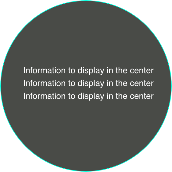
Here is the thing. I received a sketch design from HIE: some text and other elements inside a circle (Just for simple and dor example).

The circle is given as a background and should change size with fixed ratio of height and width according to the webpage height. OK. this is not that easy, because usually we keep fixed ratio according to the width. I will talk in another blog.
But the problem is, how to make the content inside the circle change as the size of the background circle changes.
For example, when the radius of the circle is 250, the font-size should be 16px, but when it changes to 200, 14px is much better.
So I do a little research on the font-size.
There are two types of length units: absolute and relative.
2. Absolute
| Unit | Description |
|---|---|
| cm | centimeters |
| mm | millimeters |
| in | inches (1in = 96px = 2.54cm) |
| px | pixels (1px = 1/96th of 1in) |
| pt | points (1pt = 1/72 of 1in) |
| pc | picas (1pc = 12 pt) |
So whether to put px in absolute or relative is a little tricky, because px is relative to the viewing device. For low-dpi devices, 1px is one device pixel (dot) of the display. For printers and high resolution screens 1px implies multiple device pixels.
3. Relative
| Unit | Description |
|---|---|
| em | Relative to the font-size of the element (2em means 2 times the size of the current font) |
| ex | Relative to the x-height of the current font (rarely used) |
| ch | Relative to width of the "0" (zero) |
| rem | Relative to font-size of the root element |
| vw | Relative to 1% of the width of the viewport* |
| vh | Relative to 1% of the height of the viewport* |
| vmin | Relative to 1% of viewport's* smaller dimension |
| vmax | Relative to 1% of viewport's* larger dimension |
| % | Relative to the parent element |
rem is obviously better than em and % since em depends on each parent element and each has their own reference, as rem have only one reference : the root element. But they all need something as reference. If the reference element's size is fixed, actually, the whole size if fixed.
vw and vh is a little tricky since use can change their web browser's size all the time, make the appearance totally uncontrollable.
But in this case, maybe vw is the best choice. However, at last I didn't take this solution because circle is only a apart of the whole screen, If an user resize his screen to a small size, it just can't give teh idea shots. But, vw is very magic, especially make everything to zoom in or out in a ratio.
Let's get some examples to understand easily.
3.1. Examples
<!DOCTYPE html>
<html>
<head>
  <style>
    .rectangle {
      background-color: green;
      max-width: 700px;
      padding-top: 100%;
      background-image: url(./cir.png);
      background-size: contain;
      background-repeat: no-repeat;
      position: relative;
    }
    .rectangle_inner_vw{
      text-align: center;
      width: 100%;
      top: 30%;
      position: absolute;
      font-size: 10vw;
    }
    .rectangle_inner_em{
      text-align: center;
      width: 100%;
      top: 60%;
      position: absolute;
      font-size: 2em;
    }
  </style>
</head>
<body>
  <div class="rectangle">
    <div class="rectangle_inner_vw">
      some VW text
    </div>
    <div class="rectangle_inner_em">
      some em text
    </div>
  </div>
</body>
</html>

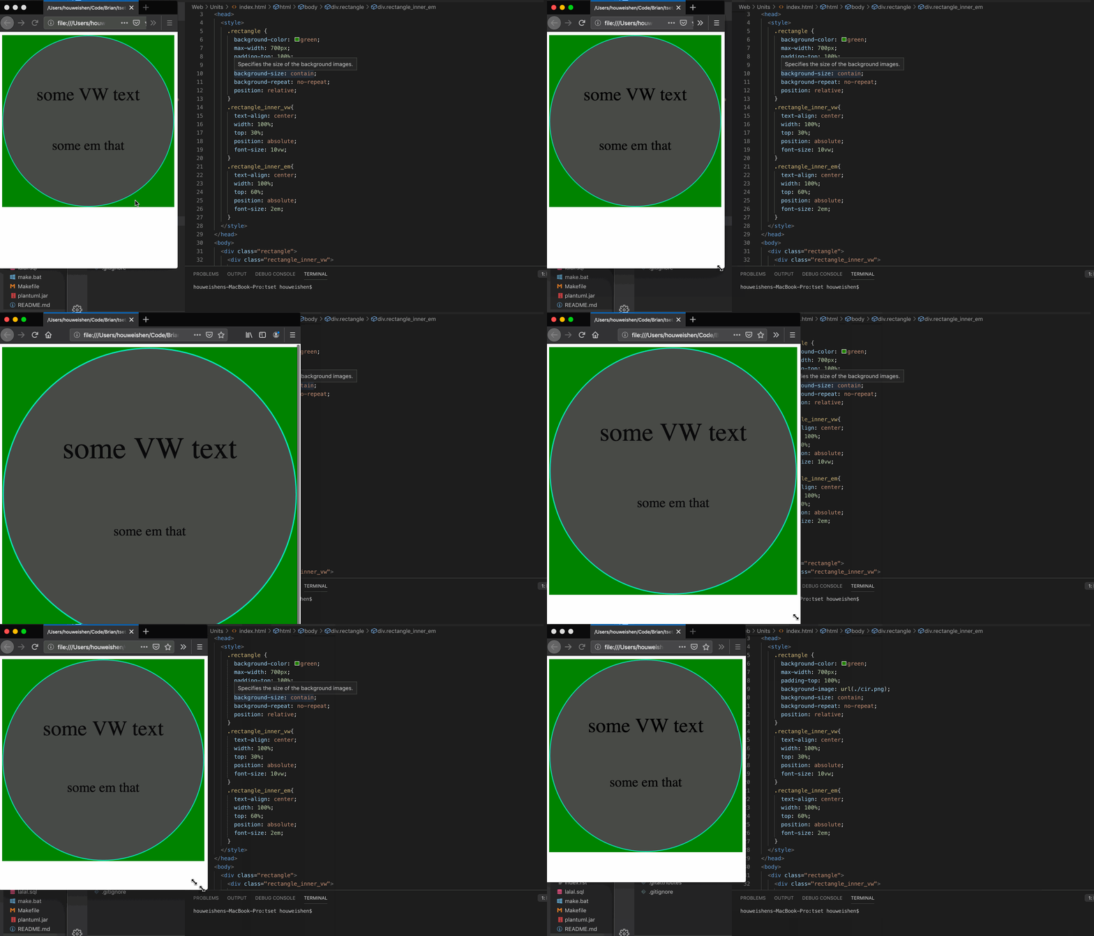
With vw , as the visual width scales, the font-size also becomes bigger. But with em , we cannot do that.
Just visit this link:

Comments !