CSS Flex And Grid
Contents
A flexible length or <flex> is a dimension with the fr unit
1. Flex
1.1. Intro
The specification describes a CSS box model optimized for user interface design. In the flex layout model, the children of a flex container can be laid out in any direction, and can “flex” their sizes, either growing to fill unused space or shrinking to avoid overflowing the parent. Both horizontal and vertical alignment of the children can be easily manipulated. Nesting of these boxes (horizontal inside vertical, or vertical inside horizontal) can be used to build layouts in two dimensions.
1.2. Four layout modes
- block layout, designed for laying out documents
- inline layout, designed for laying out text
- table layout, designed for laying out 2D data in a tabular format
- positioned layout, designed for very explicit positioning without much regard for other elements in the document
1.3. Samples
index.html :
<!DOCTYPE html>
<html>
<head>
<title>CSS Variables</title>
<meta http-equiv="content-type" content="text/html; charset=UTF-8" />
<style>
.flex-test {
border: 1px red solid;
}
.flex-test > * {
border: 1px black solid;
border-collapse: collapse;
border-radius: 3px;
margin:1px;
}
</style>
</head>
<body>
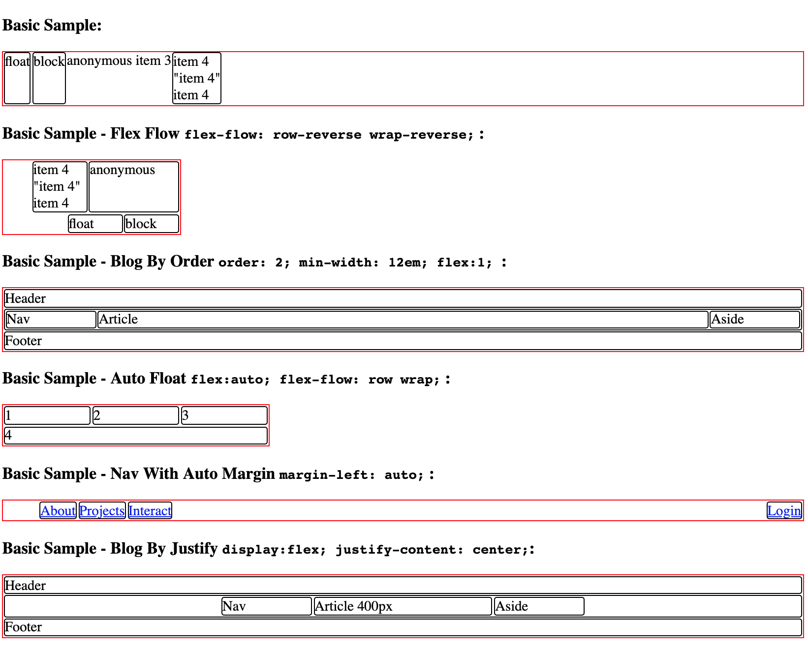
<h3>Basic Sample:</h3>
<div class="flex-test" style="display:flex">
<!-- flex item: block child -->
<div id="item1">block</div>
<!-- flex item: floated element; floating is ignored -->
<div id="item2" style="float: left; order:-1;">float</div>
<!-- flex item: anonymous block box around inline content -->
anonymous item 3
<!-- flex item: inline child -->
<span>
item 4
<!-- flex items do not split around blocks -->
<q style="display: block" id=not-an-item>item 4</q>
item 4
</span>
</div>
<h3>Basic Sample - Flex Flow <code>flex-flow: row-reverse wrap-reverse;</code> :</h3>
<div class="flex-test" style="display:flex; width:200px; flex-flow: row-reverse wrap-reverse;">
<!-- flex item: block child -->
<div id="item1" style="width:60px;">block</div>
<!-- flex item: floated element; floating is ignored -->
<div id="item2" style="float: left; width:60px;">float</div>
<!-- flex item: anonymous block box around inline content -->
<div style="width:100px;">anonymous</div>
<!-- flex item: inline child -->
<span style="width:60px;">
item 4
<!-- flex items do not split around blocks -->
<q style="display: block" id=not-an-item>item 4</q>
item 4
</span>
</div>
<h3>Basic Sample - Blog By Order <code>order: 2; min-width: 12em; flex:1; </code>:</h3>
<div class="flex-test">
<header>Header</header>
<main class="flex-test" style="display:flex;">
<article style="order: 2; min-width: 12em; flex:1; ">Article</article>
<nav style="order: 1; width: 100px;">Nav</nav>
<aside style="order: 3; width: 100px;">Aside</aside>
</main>
<footer>Footer</footer>
</div>
<h3>Basic Sample - Auto Float <code>flex:auto; flex-flow: row wrap;</code> :</h3>
<div class="flex-test" style="display: flex; flex-flow: row wrap; width: 300px;">
<div style="width: 80px; flex:auto;">1</div>
<div style="width: 80px; flex:auto;">2</div>
<div style="width: 80px; flex:auto;">3</div>
<div style="width: 80px; flex:auto;">4</div>
</div>
<h3>Basic Sample - Nav With Auto Margin <code>margin-left: auto;</code> :</h3>
<nav>
<ul class="flex-test" style="display: flex; list-style: none;">
<li><a href=/about>About</a>
<li><a href=/projects>Projects</a>
<li><a href=/interact>Interact</a>
<li style="margin-left: auto;"><a href=/login>Login</a>
</ul>
</nav>
<h3>Basic Sample - Blog By Justify <code>display:flex; justify-content: center;</code>:</h3>
<div class="flex-test">
<header>Header</header>
<main class="flex-test" style="display:flex; justify-content: center;">
<article style="order: 2; width:200px ">Article 400px</article>
<nav style="order: 1; width: 100px;">Nav</nav>
<aside style="order: 3; width: 100px;">Aside</aside>
</main>
<footer>Footer</footer>
</div>
</body>
</html>
Results:
Quite fun!
1.4. Attributions
display: flex | inline-flex
flex-direction: row | row-reverse | column | column-reverse
flex-wrap: nowrap | wrap | wrap-reverse
flex-flow: <‘flex-direction’> || <‘flex-wrap’>
order: <integer>
flex: none | [ <‘flex-grow’> <‘flex-shrink’>? || <‘flex-basis’> ]
flex-grow: <number>
flex-shrink: <number>
flex-basis: content | <‘width’>
justify-content: flex-start | flex-end | center | space-between | space-around
align-items:  flex-start | flex-end | center | baseline | stretch
align-self: auto | flex-start | flex-end | center | baseline | stretch
align-content: flex-start | flex-end | center | space-between | space-around | stretch
2. Grid
2.1. Intro
Grid Layout is a new layout model for CSS that has powerful abilities to control the sizing and positioning of boxes and their contents. Unlike Flexible Box Layout, which is single-axis–oriented, Grid Layout is optimized for 2-dimensional layouts: those in which alignment of content is desired in both dimensions.
Although many layouts can be expressed with either Grid or Flexbox, they each have their specialties.
- Grid enforces 2-dimensional alignment, uses a top-down approach to layout, allows explicit overlapping of items, and has more powerful spanning capabilities.
- Flexbox focuses on space distribution within an axis, uses a simpler bottom-up approach to layout, can use a content-size–based line-wrapping system to control its secondary axis, and relies on the underlying markup hierarchy to build more complex layouts.
It is expected that both will be valuable and complementary tools for CSS authors.
2.2. Samples
<!DOCTYPE html>
<html>
<head>
<title>CSS Grid</title>
<meta http-equiv="content-type" content="text/html; charset=UTF-8" />
<style>
.grid-test {
border: 1px red solid;
}
.grid-test > * {
border: 1px black solid;
border-collapse: collapse;
border-radius: 3px;
margin:1px;
}
</style>
</head>
<body>
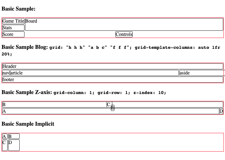
<h3>Basic Sample:</h3>
<div class="grid-test" style="display: grid; grid-template-columns: auto 1fr; grid-template-rows: auto 1fr auto;">
<div id="title" style="grid-column: 1; grid-row: 1;">Game Title</div>
<div id="score" style="grid-column: 1; grid-row: 3;">Score</div>
<div id="stats" style="grid-column: 1; grid-row: 2; align-self: start;">Stats</div>
<div id="board" style="grid-column: 2; grid-row: 1 / span 2;">Board</div>
<div id="controls" style="grid-column: 2; grid-row: 3; justify-self: center;">Controls</div>
</div>
<h3>Basic Sample Blog: <code>grid: "h h h" "a b c" "f f f"; grid-template-columns: auto 1fr 20%;</code></h3>
<div class="grid-test" style='display: grid; grid: "h h h" "a b c" "f f f"; grid-template-columns: auto 1fr 20%;'>
<header style="grid-area: h;">Header</header>
<article style="grid-area: b; min-width: 12em;">article</article>
<nav style="grid-area: a;">nav</nav>
<aside style="grid-area: c; min-width: 12em;">aside</aside>
<footer style="grid-area: f;">footer</footer>
</div>
<style type="text/css">
#grid3 {
display: grid;
grid-template-columns: 1fr 1fr;
grid-template-rows: 1fr 1fr
}
#A { grid-column: 1 / span 2; grid-row: 2; align-self: end; }
#B { grid-column: 1; grid-row: 1; z-index: 10; }
#C { grid-column: 2; grid-row: 1; align-self: start; margin-left: -20px; }
#D { grid-column: 2; grid-row: 2; justify-self: end; align-self: start; }
#E { grid-column: 1 / span 2; grid-row: 1 / span 2;
z-index: 5; justify-self: center; align-self: center; }
</style>
<h3>Basic Sample Z-axis: <code>grid-column: 1; grid-row: 1; z-index: 10; </code></h3>
<div id="grid3" class="grid-test" >
<div id="A">A</div>
<div id="B">B</div>
<div id="C">C</div>
<div id="D">D</div>
<div id="E">E</div>
</div>
<h3>Basic Sample Implicit</h3>
<style>
#grid4 {
display: grid;
grid-template-columns: 20px;
grid-auto-columns: 40px;
grid-template-rows: 20px;
grid-auto-rows: 40px;
}
#A4 { grid-column: 1; grid-row: 1; }
#B4 { grid-column: 2; grid-row: 1; }
#C4 { grid-column: 1; grid-row: 2; }
#D4 { grid-column: 2; grid-row: 2; }
</style>
<div id="grid4" class="grid-test">
<div id="A4">A</div>
<div id="B4">B</div>
<div id="C4">C</div>
<div id="D4">D</div>
</div>
</body>
</html>
Results:
2.3. Attributions
display: grid | inline-grid
grid-template-columns, grid-template-rows:    none | <track-list> | <auto-track-list>

    <track-list>          = [ <line-names>? [ <track-size> | <track-repeat> ] ]+ <line-names>?
    <auto-track-list>     = [ <line-names>? [ <fixed-size> | <fixed-repeat> ] ]* <line-names>? <auto-repeat>
                            [ <line-names>? [ <fixed-size> | <fixed-repeat> ] ]* <line-names>?
    <explicit-track-list> = [ <line-names>? <track-size> ]+ <line-names>?

    <track-size>          = <track-breadth> | minmax( <inflexible-breadth> , <track-breadth> ) | fit-content( <length-percentage> )
    <fixed-size>          = <fixed-breadth> | minmax( <fixed-breadth> , <track-breadth> ) | minmax( <inflexible-breadth> , <fixed-breadth> )
    <track-breadth>       = <length-percentage> | <flex> | min-content | max-content | auto
    <inflexible-breadth>  = <length-percentage> | min-content | max-content | auto
    <fixed-breadth>       = <length-percentage>
    <line-names>          = '[' <custom-ident>* ']'

grid-template-areas: none | <string>+
grid-template: none | [ <‘grid-template-rows’> / <‘grid-template-columns’> ] | [ <line-names>? <string> <track-size>? <line-names>? ]+ [ / <explicit-track-list> ]?
grid-auto-columns, grid-auto-rows: <track-size>+
grid-auto-flow: [ row | column ] || dense
grid:         <‘grid-template’> | <‘grid-template-rows’> / [ auto-flow && dense? ] <‘grid-auto-columns’>? | [ auto-flow && dense? ] <‘grid-auto-rows’>? / <‘grid-template-columns’>
grid-row-start, grid-column-start, grid-row-end, grid-column-end:     <grid-line>
grid-row, grid-column: <grid-line> [ / <grid-line> ]?
grid-area: <grid-line> [ / <grid-line> ]{0,3}
Comments !