CSS Custom Properties, Less and Theme
Contents
1. Intro
Why I writing this article is that one of my customers needed dark theme. I was thinking maybe I can use two different types of CSS file to render different themes. But it was a little stupid because that means I have to generated two such style cascading files. In Less, I can just define several basic theme colors variables, and If the theme changed, all I need to do is to change the variables. That would save time and efforts.
While variables is quite easy in Less, and I was thinking if the feature is also supported by CSS? And although we have always talked about CSS3, then was it within its scope or was already included even before?
So I just sort up for myself about this concepts.
2. CSS custom properties
Yes, it is the name.
Custom properties (sometimes referred to as CSS variables or cascading variables) are entities defined by CSS authors that contain specific values to be reused throughout a document. They are set using custom property notation (e.g., --main-color: black; ) and are accessed using the var() function (e.g., color: var(--main-color); ).
2.1. Basic Usage
Declare:
element {
  --main-bg-color: brown;
}
Use:
element {
  background-color: var(--main-bg-color);
}
Wow, quite easy.
3. Theme
So one big benefit of CSS variable is that, we can just change the whole appearance in seconds. This will lead to colorful and fantastic themes.
For example, if our application's default background color is white, we can provide a button and provide a red background just by change the color variable.
3.1. Sample
index.html:<!DOCTYPE html> <html> <head> <title>CSS Variables</title> <meta http-equiv="content-type" content="text/html; charset=UTF-8" /> <script type="text/javascript"> const changeThemeToRed = function(){ document.documentElement.setAttribute('data-theme', 'red-theme'); } const changeThemeToWhite = function(){ document.documentElement.removeAttribute('data-theme'); } </script> <link rel="stylesheet" href="./index.css" type="text/css" /> </head> <body> <button onclick="changeThemeToRed()">To Red Theme</button> <button onclick="changeThemeToWhite()">To White Theme</button> <p id="res">Test Some Text, Watch The Color!</p> </body> </html>
index.css:html[data-theme="red-theme"] { --main-bg-color: red; --main-color: white; } html { --main-bg-color: white; --main-color: red; } body { background-color: var(--main-bg-color); color: var(--main-color); }And when we click the
To Red ThemeButton, our theme is changed! Wow, quite simple!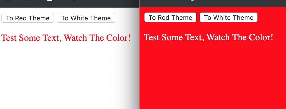
4. Less
When I was at school, I don't know that there was a magic tool like Less which makes CSS quite easy.
However, I'm not regret, because my basic experience help me learn the very basic knowledge and concept of CSS. So even nowadays there are different frameworks and less or sass, I think I can accept those concepts quickly.
But I still have to make a tour over Less so that I can make the most of it.
4.1. Variables
@width: 10px;
@height: @width + 10px;

#header {
  width: @width;
  height: @height;
}
4.2. Mixins
.bordered {
  border-top: dotted 1px black;
  border-bottom: solid 2px black;
}
#menu a {
  color: #111;
  .bordered();
}
4.3. Nesting
#header {
  color: black;
  .navigation {
    font-size: 12px;
  }
  .logo {
    width: 300px;
  }
}

/* & represents the current selector parent */
.clearfix {
  display: block;
  zoom: 1;

  &:after {
    content: " ";
    display: block;
    font-size: 0;
    height: 0;
    clear: both;
    visibility: hidden;
  }
}
4.4. Nested At-Rules and Bubbling
.component {
  width: 300px;
  @media (min-width: 768px) {
    width: 600px;
    @media  (min-resolution: 192dpi) {
      background-image: url(/img/retina2x.png);
    }
  }
  @media (min-width: 1280px) {
    width: 800px;
  }
}
=>
.component {
  width: 300px;
}
@media (min-width: 768px) {
  .component {
    width: 600px;
  }
}
@media (min-width: 768px) and (min-resolution: 192dpi) {
  .component {
    background-image: url(/img/retina2x.png);
  }
}
@media (min-width: 1280px) {
  .component {
    width: 800px;
  }
}
4.5. Operations
+,-,*,/calc() exception
@var: 50vh/2;
width: calc(50% + (@var - 20px));  // result is calc(50% + (25vh - 20px))
4.6. Escaping
@min768: ~"(min-width: 768px)";
.element {
  @media @min768 {
    font-size: 1.2rem;
  }
}
4.7. Functions
@base: #f04615;
@width: 0.5;

.class {
  width: percentage(@width); // returns `50%`
  color: saturate(@base, 5%);
  background-color: spin(lighten(@base, 25%), 8);
}
4.8. Maps
#colors() {
  primary: blue;
  secondary: green;
}

.button {
  color: #colors[primary];
  border: 1px solid #colors[secondary];
}
4.9. Scope
Local First
@var: red;

#page {
  @var: white;
  #header {
    color: @var; // white
  }
}
4.10. Importing
@import "library"; // library.less
@import "typo.css";
5. CSS 3 Modules
- Borders
- border-color
- border-image
- border-radius
- box-shadow
- Backgrounds
- background-origin and background-clip
- background-size
- multiple backgrounds
- Color
- HSL colors
- HSLA colors
- opacity
- RGBA colors
- Text effects
- text-shadow
- text-overflow
- word-wrap
- User-interface
- box-sizing
- resize
- outline
- nav-top, nav-right, nav-bottom, nav-left
- Selectors
- attribute selectors
- Basic box model
- overflow-x, overflow-y
- Generated Content
- content
- Other modules
- CSS3 Transitions
- media queries
- multi-column layout
- Web fonts
- speech
Comments !